

The album cover for Hot fuss has a blue colour scheme, with the connotations being that of a mellow as well as somewhat calmness which can foreshadow the songs that are contained within the album, this can also be decoded to be of a masculine origin meaning that the album could be more oriented towards a male target audience than that of a female, so when it comes to creating my own digipak I will have to consider the usefulness of colour in representing my song choice as well as the target audience that I will attempt to appeal to, in an attempt to appeal to the hegemonic audience i would have to blend colours in order to get a subconscious reading of the text attracting males to the pack.
The fact that the title is "HOT FUSS" has the connotations of someone being needy as well as difficult, which can be seen to be relatable for audiences with it drawing parallels to Dyer's star theory, as the audience can be seen as in the same situation as the artist due to the conscious reading, it creates a rapport between the artist as well as the audience. This is a necessity for audiences to purchase the album, as well as keeping as role models for a younger audience. We can also infer voyeurism through the "HOT" represented through star theory with artists being seen through the male gaze and or female gaze theory, keeping audiences captivated to enjoy their audiences and buy their music. When it comes to my creation of a digipak, I think to have a title of the album which represents the songs within, but also the intentions of the artist, it can draw parallels to the audience on a deeper level.
The font used on the title as well as the name of the band can be seen as quite cold and or simplistic, much like the visuals of the all blue background (Bar small amounts of apartments). It creates a bleak scene, which focuses more so upon the music than that of the actual album itself, taking away from the visuals in order to focus more so upon the music itself as an art form.
The Chinese seen on top of the buildings means "Construction material development" this can draw parallel to society, with it being surrounded with materialistic goods and needs since the end of World War 2. It is this indie rock band that encodes this through Hall's reception theory and it is up to the audience in order to decode the meaning of the Chinese written on this building in Shanghai. When I create my own album cover, it would be beneficial to have there be something encoded for the audience to decode, which would cause the audience to interact more with the album cover. This would add a deeper meaning to my work and create a more interesting cover through voyeurism of the hidden messages on the cover.


We further see a simplistic style of layout within the Arctic monkey's album 'AM'. The colour scheme is monochrome which has the colour representation of something classical, or of a sense of binary opposition through the light being representative of purity and the black being that of evil and darkness. The fact that the sound waves are white could be representative of the music being pure and it is the voyeurism that could be seen of the sound wave due to it's simplicity as well as aesthetic within the style of their music being a classical style. This binary opposition could be utilised in my work and could be used to show off who the self-proclaimed "Fire starter" actually is by using colours such as red and black and or black and white as seen in the cover on the right.
There is no visible title seen on the top of this album cover. This could add Barthes' enigma theory to the cover. this won't be utilised within my album cover due to the fact that it is something that is unconventional of the genre and I would like for my digipak to appeal to the majority of the audience rather than a nice audience due to the popularity of my singer and the simplistic style is something that I would like to incorporate within my work. The colours are stereo typically darker and faded in order to give the impression that it is an old album and to keep it somewhat traditional. This is aimed at the target audience of the indie rock genre as the simplistic style that they have seen many times before appeals to them after polling those who enjoy that style of music on their opinions on the album covers.
 The sound waves have specific connotations to music and the songs within them as seen with the link between the song titled 'Mad Sounds' and the artwork on the front of the album. I think it would be beneficial to link one of my songs to the artwork that can be seen on the cover of the album.
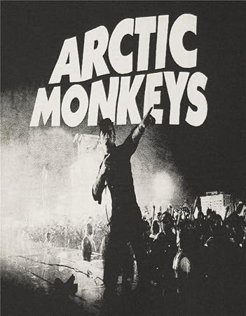
What this ancillary research has taught me is that there has to be a clear colour scheme that is kept to throughout in order to maintain continuity. Many bands such as The Arctic Monkeys use a similar and or the same font throughout their tours, albums and singles in order to add a sense of familiarity which could be utilised throughout my ancillary tasks on the magazine advert as well as the album cover. The style is a bold disjointed font style, which looks intentionally slanted. In my product when i create it, I will include a style of font that is bold as well as in the key image, central in order to make it clear to a member of the public buying the album who it actually is. When it comes to creating my magazine, I will make it of a similar style to that of my album cover and use the same font from it. As seen in the Arctic monkeys advert (above) as the font is very similar if not the same to that of the album "AM" so it is something that I want to attempt to use in my magazine advert.

The indie rock genre don't typically have artists on the cover of their albums, but one that stands out as a cover that has the artist on is 'Sacred heart club' by Foster the People. The artists can be seen to be the key image more so than the title of the album. In the rule of thirds, the group can be seen as the dominant image with the title of the album being barely visible due to it being the handwriting of Mark Foster (creator of the band). The lighting seen on the band is low key top lighting and can be seen to cast shadows on the artists face and could cause some enigma as to what it could mean, with the representation being that there is a split personality and or something hidden by them. This lighting could be utilised within my cover if i was to include my artist on the cover. I would be influenced by the 'Sacred Hearts Club' to use top lighting that was low key in order to get the same effect and cast shadows across my artists face as the indie rock genre has a lot of mystery shrouded around it. The experimental shot type that I may try and use could be the medium long shot seen above with my artist in a dark corridor. The magazine advert for the same album is the exact same as the album cover and this could represent the simplicity of it all. When it comes to my advert, I would like for it to be similar but not entirely the same, just linking to the album cover.
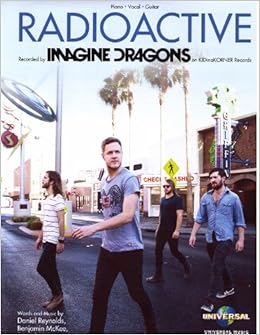 In the Imagine Dragon advert for Radioactive, we can see how the band is the key image in the middle of the advert showing their dominance as well as to show off the band in their entirety. As well as this, the lighting is high key natural top lighting, this gives the representation of purity, which may draw in a younger target audience as the music may be more friendly to that demographic. With my ancillary task, I wouldn't want to have such a light style of lighting, due to the fact that my song is about being a trouble starter, so it wouldn't work very well as it would contrast the dark style of music that is portrayed in my music video and on the album when it's created. As well as this, the name of the album is larger than the name of the band to emphasise it and advertise it to the audience. The band name has the font which can be seen on all of their albums as well as posters, causing that association with other music for fans of theirs. This is a symbolic image of conformity as they are crossing at a crossing showing that they're good upstanding citizens who don't jaywalk or break the law.
The editing software that I would use would be Serif Drawplus 6. This is due to the fact that i have used it before and at the very top we can see that there are insert, edit and tool icons that can be used along with the wheel on the right in order to edit successfully. The colour wheel as well as buttons beneath it mean that I can change the opacity, colour and our brightness. I will use that to my advantage, due to the fact that the album cover for AM as well as Hot Fuss have dark lighting as well as Sacred Hearts Club which shows the artist, I will have a look at what I could do in order to give the same effect upon my artist as seen in the Sacred Hearts club album cover as well as magazine. When it comes to my magazine, I will utilise the text tool as well as editing tool when it comes to my magazine as I will have to put the details of the album as well as other images on to it and it would make it easier for me to use them and to incorporate the things that I want through that.


